THE BRIEF
Zahava approached me with the request to create a logo and colour palette that would capture the essence of ABL, a not-for-profit initiative focused on empowerment, resilience, and positivity. The key elements she wanted reflected in the visual identity were joy, inspiration, fun, and femininity, all while staying true to her personal journey and message of overcoming challenges with humour and strength.
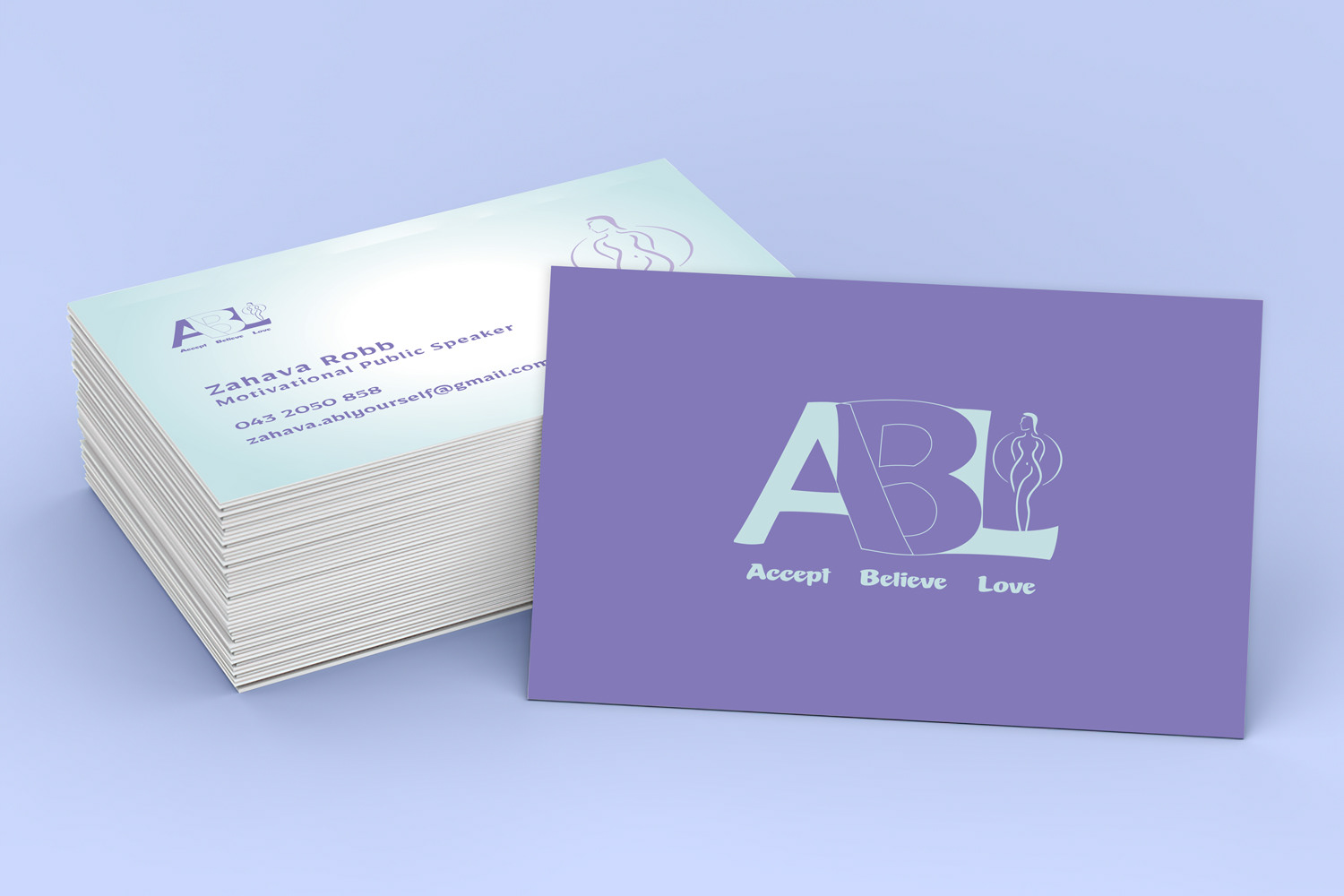
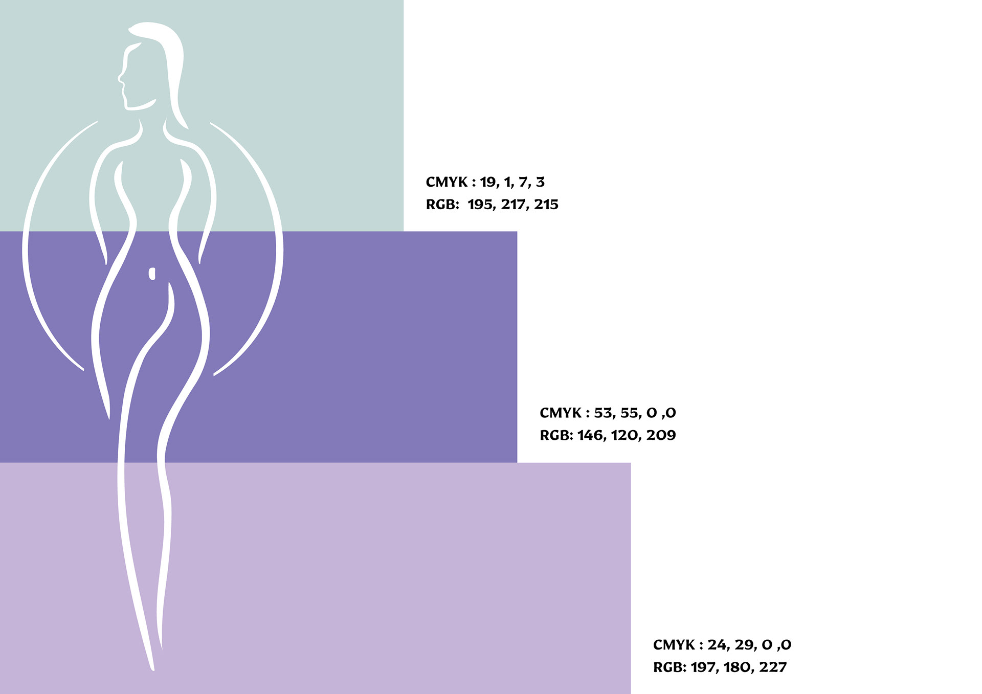
THE LOGO
To reflect the core values of ABL, I developed a logo that combines playful and feminine elements with an uplifting, motivational feel. The use of soft curves in the woman's figure evokes warmth and approachability, while the blocky, intersecting letters hint at strength and resilience. The logo is designed to be simple yet impactful, embodying the idea of moving forward with confidence and joy.

COLOR SCHEME
The colour palette was chosen to complement the logo concept, with soft yet vibrant tones that radiate energy, positivity, and inclusivity. Together, the logo and colour scheme create a visual identity that is both engaging and elegant, aligning with Zahava's mission to inspire and connect people through her personal story.
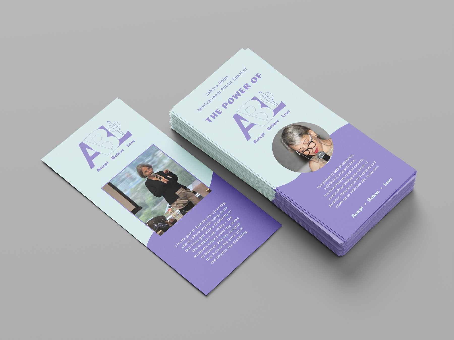
PROMOTIONAL BRAND MATERIAL
To support ABL’s outreach, I designed a brochure that communicates the brand’s message with clarity, warmth, and a personal touch. The layout, typography, and colour palette work cohesively to reflect ABL’s identity — joyful, inspirational, and empowering — while offering an engaging and accessible introduction to Zahava’s story and mission.