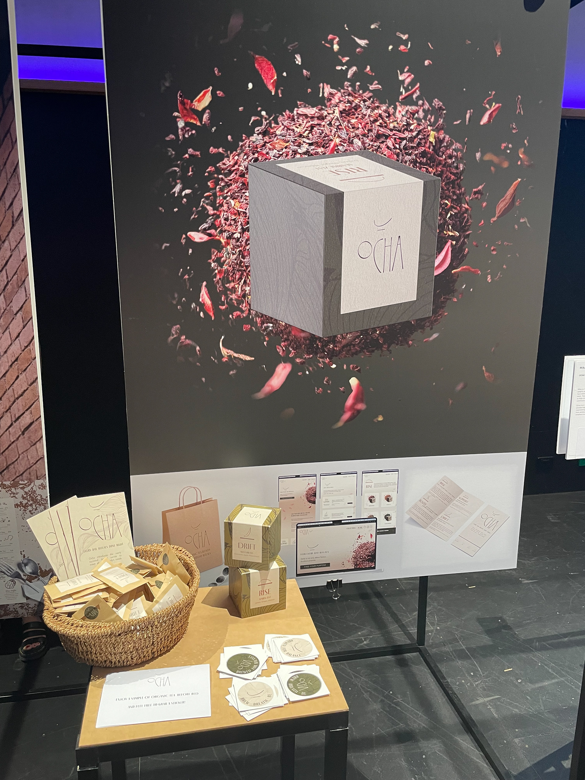
THE BRAND
Ocha is an Australian organic herbal tea brand. Its purpose is to provide high-quality blends to curate a healthy living experience, while maintaining a minimal environmental footprint during the process from production to post-use. The brand enhances daily rituals with an emphasis on both physical and mental health.

BRAND IDENTITY
The brand wanted to establish its presence with a strong visual identity that blends naturalism, luxury, and imperfection.
INSPIRATION
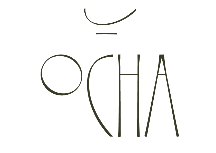
The logo was inspired by the Japanese idea of Wabi Sabi. Wabi Sabi is a concept that is described by a feeling. It is beyond aesthetics, or what we think of as traditional Japanese beauty. It is the beauty of imperfection. It's an integration of artistic concept and philosophy (Walther, 2021). This idea is incorporated into the brand's identity and goes hand in hand with the brand's mission.
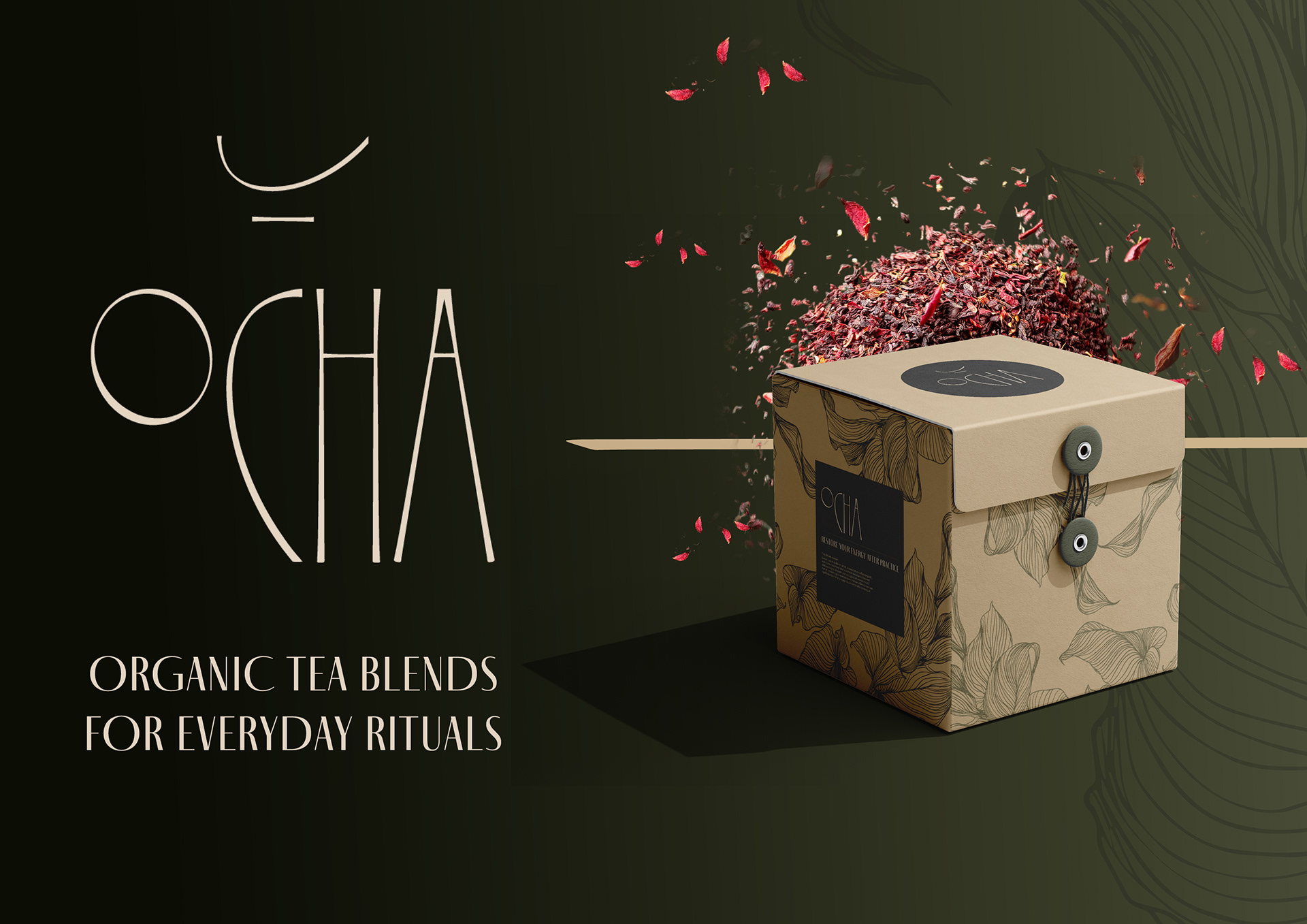
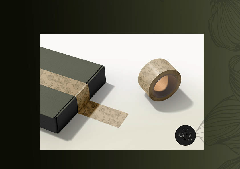
PROMOTIONAL MATERIAL
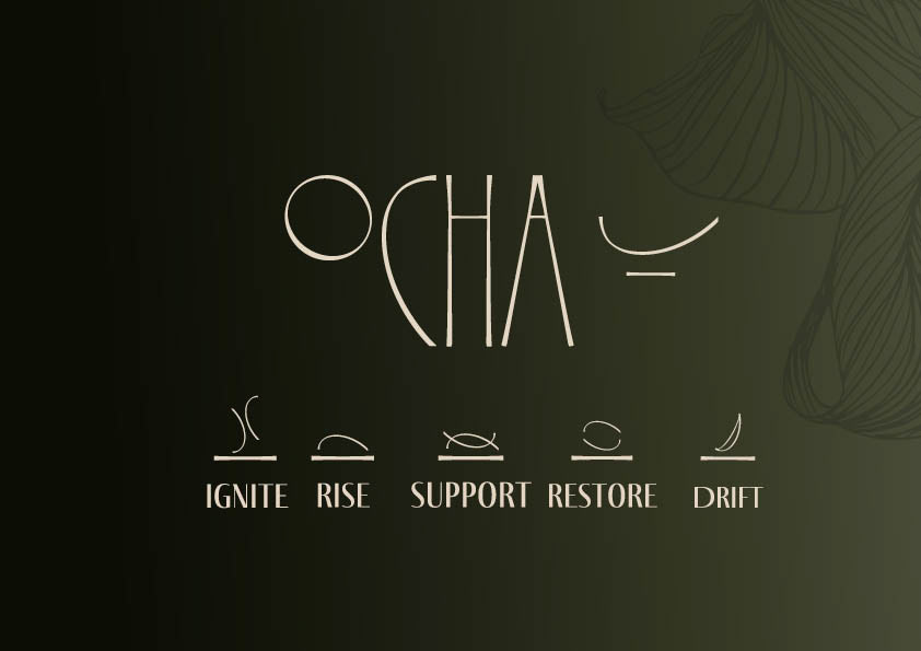
Ocha is about creating a moment of self-reflection on the users' inner feelings and essential needs. That intention shaped the tea collections, each crafted with a specific purpose in mind.
Each collection is marked by its own symbol, thoughtfully crafted from the same strokes as the logo. These symbols were designed to maintain visual harmony across the brand, while subtly reflecting the unique purpose of each blend.
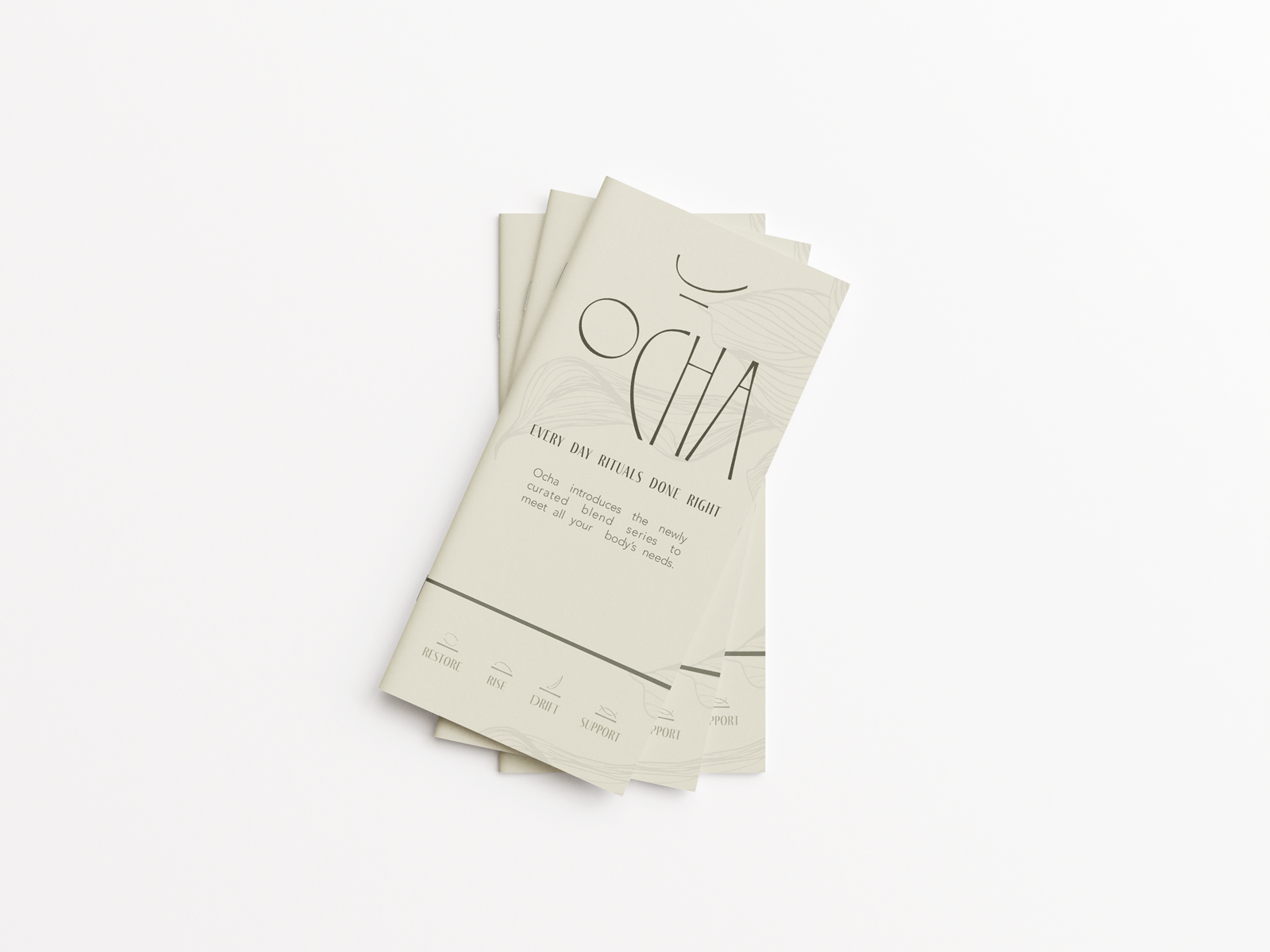
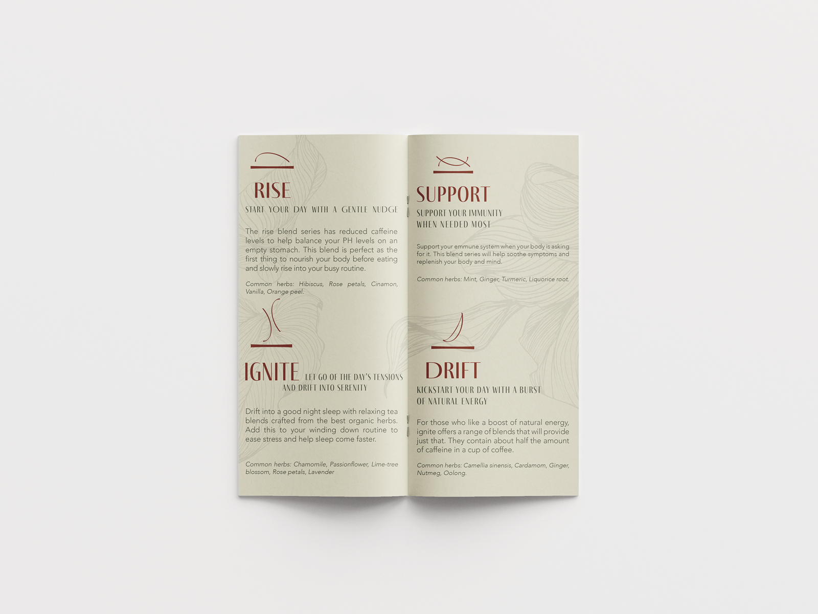
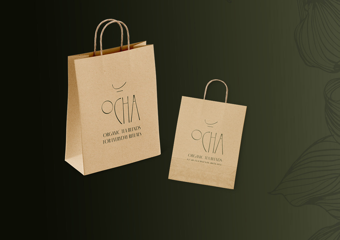
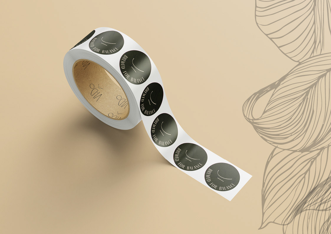
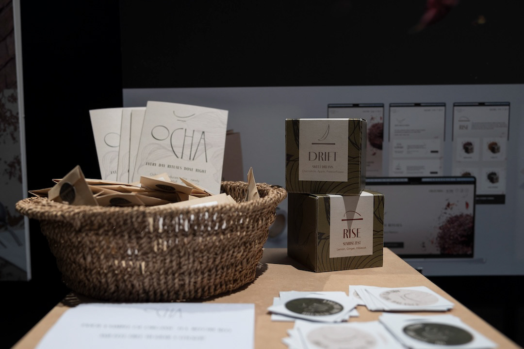
Image by Masimba Sasa
LANDING PAGE & WEBSITE
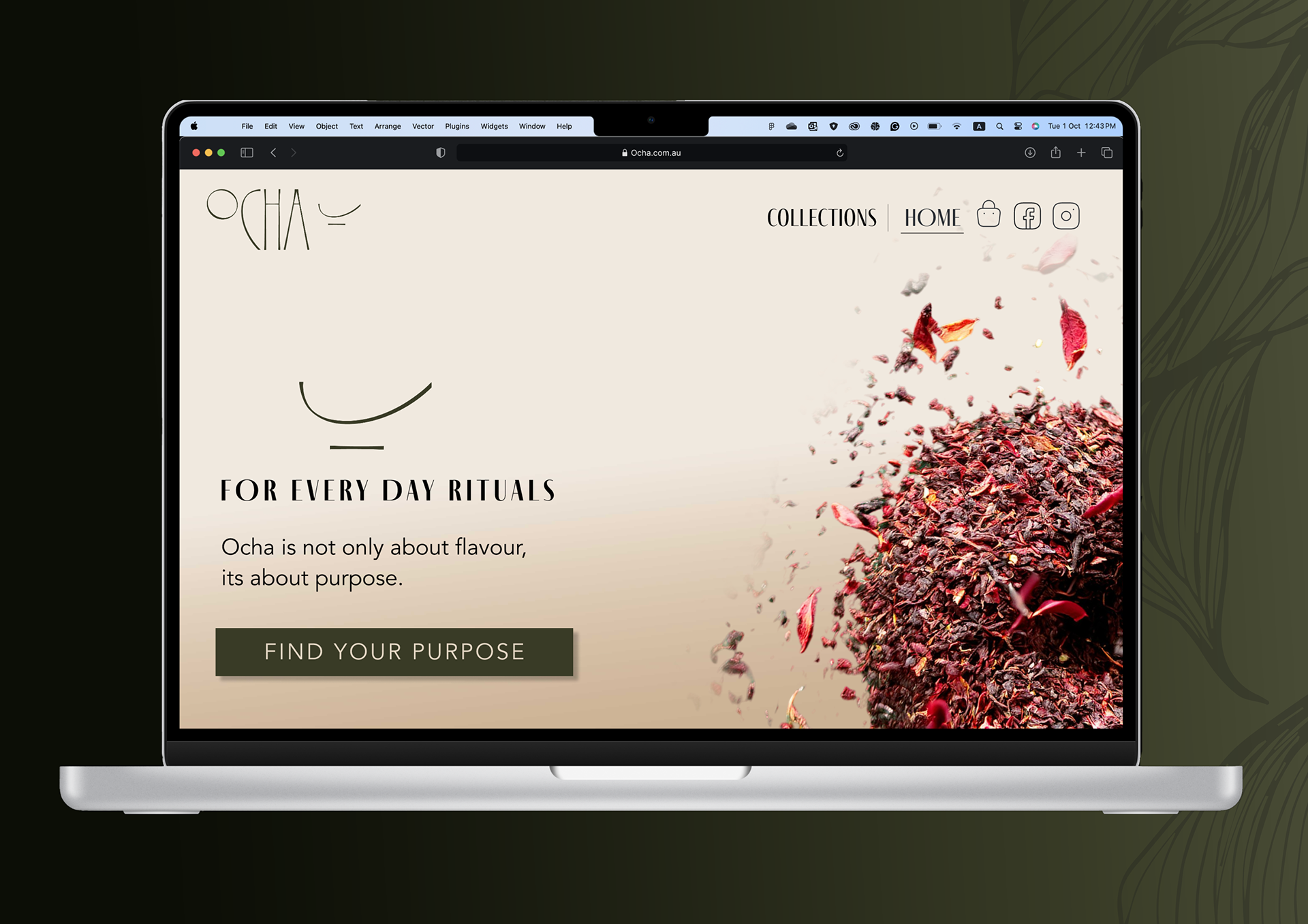
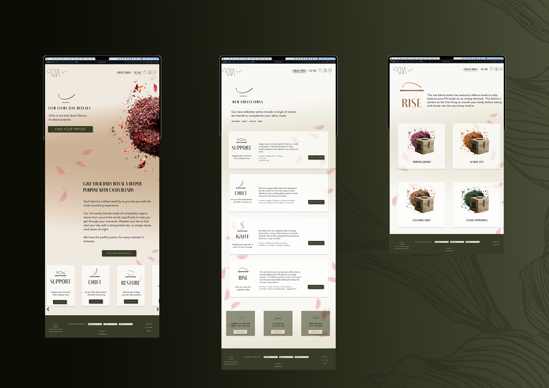
This project has won the People's Choice award at the Queensland University of Technology Design Festival Exhibition.

Image by Masimba Sassa